Case Study · 2025
That assumption fails for 25% of users — the ones who freeze entirely when danger arrives. The more dangerous the situation, the harder any multi-step interface becomes to use.
88% of people want to learn survival skills. 0 apps on the market teach them. There is a gap between crisis response tools and everyday safety education — and no product has crossed it.
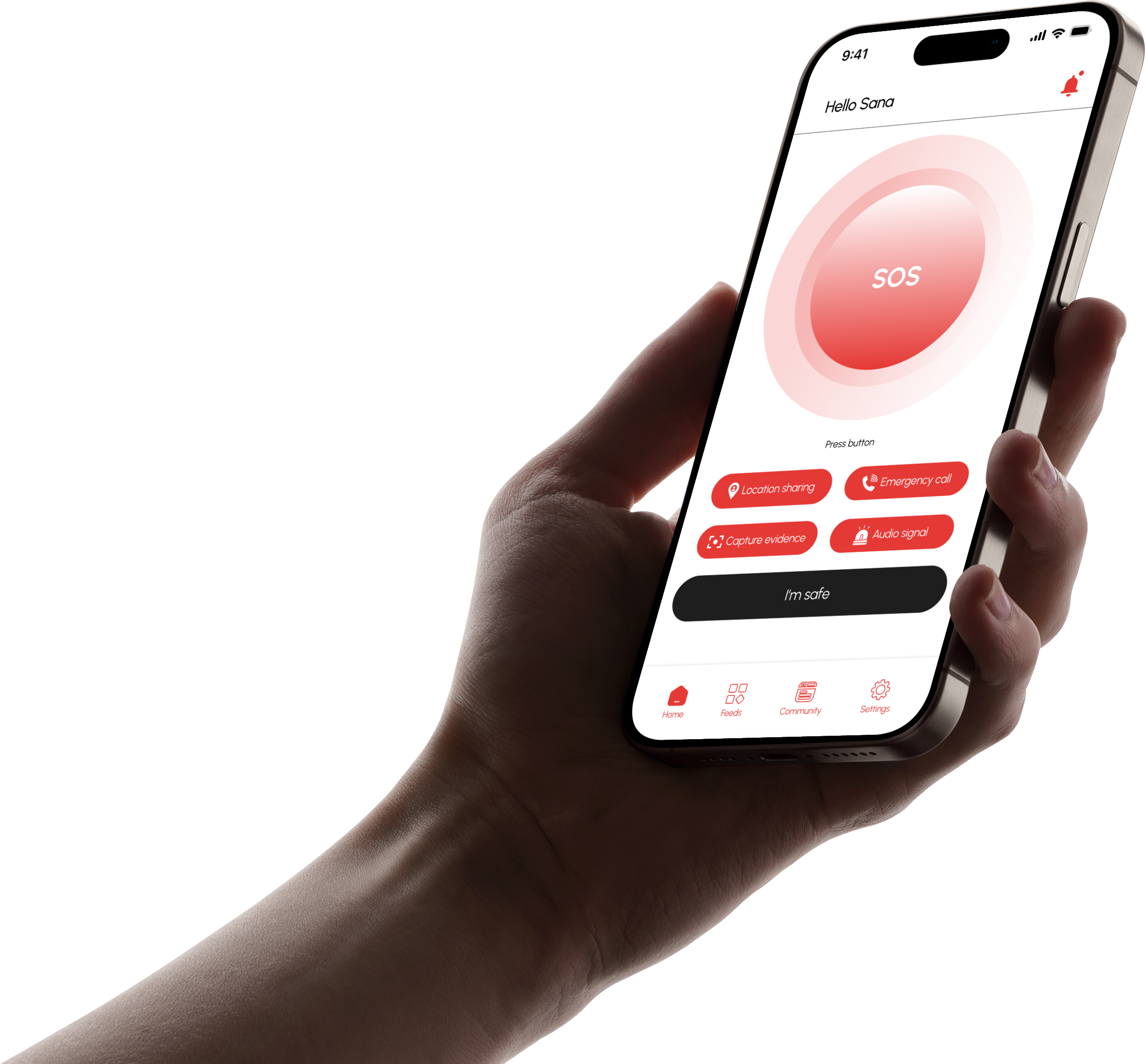
One tap sends instant help — no thinking required. A built-in community teaches real survival skills so users are never starting from zero when danger arrives.
Solo UX/UI Designer — design thinking, design system, prototyping and testing
3 months
Figma, FigJam, Google Form
Personal project — mobile safety app concept for iOS and Android
Before designing Alerna, I audited the top personal safety apps currently available globally to understand what the market offers — and where it falls short.
Personal SOS & surveillance
Gap: No education layer. Core features paywalled.
Professional emergency dispatch
Gap: US-only. Subscription required. Zero community or skill-building.
Family location tracking
Gap: Designed for families, not individuals. Privacy concerns over data selling.
Community incident reporting
Gap: Reactive, not proactive. No SOS button. No skill education.
Simple one-tap SOS
Gap: Single feature only. No community, no education, no location tracking.
Gesture-triggered SOS
Gap: Single-feature app. No preparation tools or educational content.
| Feature | bSafe | Noonlight | Life360 | Citizen | Red Panic | Shake2Safety | Alerna |
|---|---|---|---|---|---|---|---|
| One-tap SOS | ✓ | ✓ | ✓ | ✗ | ✓ | ✓ | ✓ |
| Silent / discreet trigger | ✓ | ✓ | ✗ | ✗ | ✗ | ✓ | ✓ |
| Real-time location sharing | ✓ | ✓ | ✓ | ✗ | ✓ | ✗ | ✓ |
| Audio / video evidence capture | ✓ | ✗ | ✗ | ✓ | ✗ | ✗ | ✓ |
| Community safety feed | ✗ | ✗ | ✗ | ✓ | ✗ | ✗ | ✓ |
| Survival skill education | ✗ | ✗ | ✗ | ✗ | ✗ | ✗ | ✓ |
| Peer story sharing | ✗ | ✗ | ✗ | ~ | ✗ | ✗ | ✓ |
| Available in Vietnam / SEA | ✓ | ✗ | ✓ | ✗ | ✓ | ✓ | ✓ |
| Free core features | ~ | ✗ | ~ | ~ | ✓ | ✓ | ✓ |
✓ Available · ✗ Not available · ~ Partial / limited
Every competitor treats safety as a reactive problem — they wait for danger, then help users respond. Not one of the top global safety apps offers survival education or a community for peer learning.
There is a 0% overlap between "SOS apps" and "safety education apps" in the current market. That gap is Alerna's territory.
Other apps give you a button for when things go wrong.
Alerna prepares you before they do — and stands by you when they do.
To understand the problem space, I used a mixed-methods approach combining secondary research and a primary survey. Secondary research drew from academic studies, public health reports, and local news coverage to establish the global and Vietnamese context for personal safety threats. Primary research consisted of a structured survey distributed to 10 participants to validate assumptions and surface user-specific needs, behaviors, and expectations.
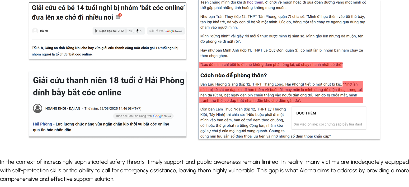
Sources: Gallup Global Law & Order Report, Lao Động newspaper, Tuổi Trẻ online.
Based on secondary research findings, I designed a structured survey around five core questions to validate the problem space and understand user behavior.
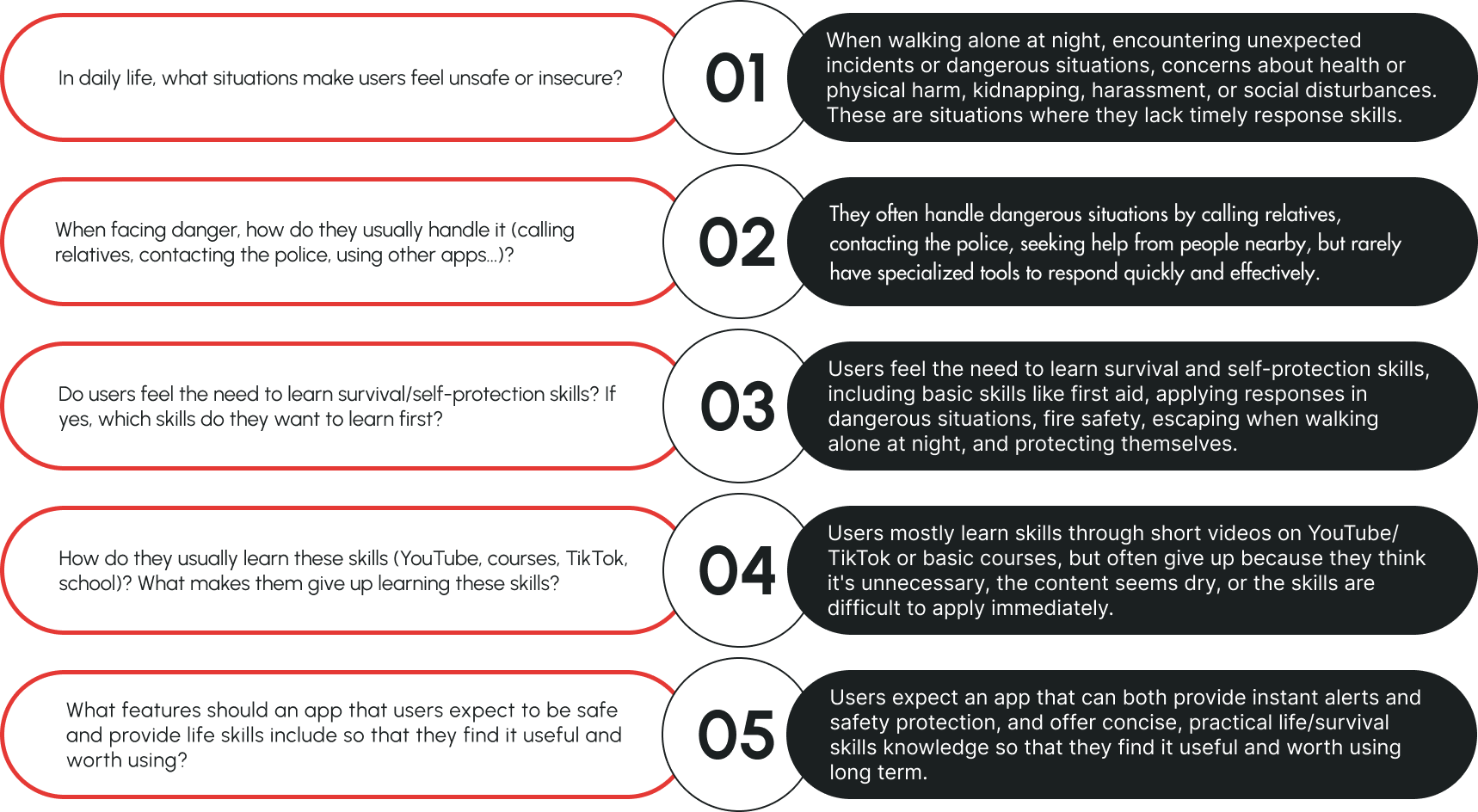
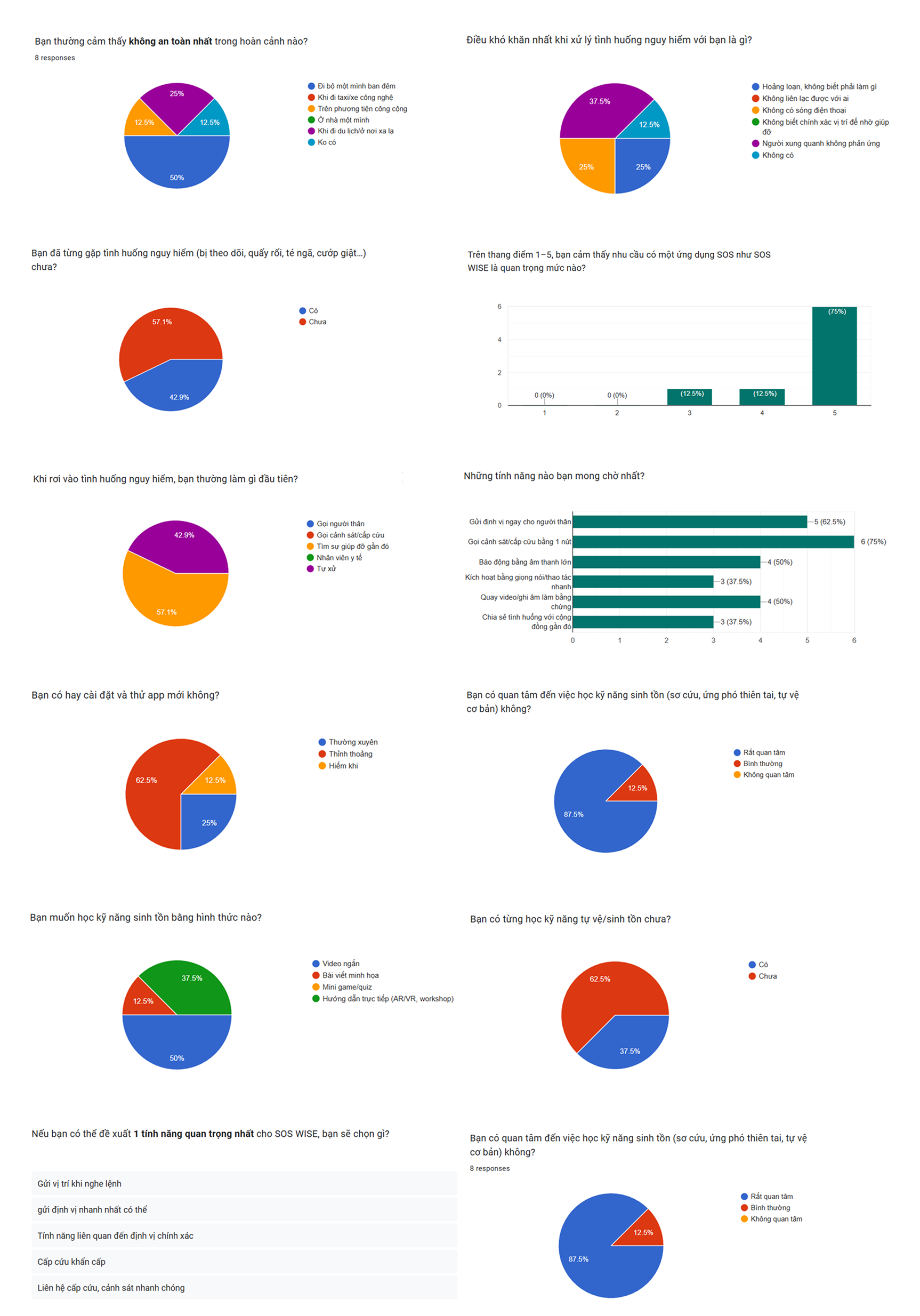
Note: With a sample size of 10, these findings are directional rather than statistically representative. They were used to validate secondary research patterns and inform persona development.
Combining secondary research and primary survey findings, three consistent patterns emerged:
Danger is real and underreported
had personally encountered a dangerous situation
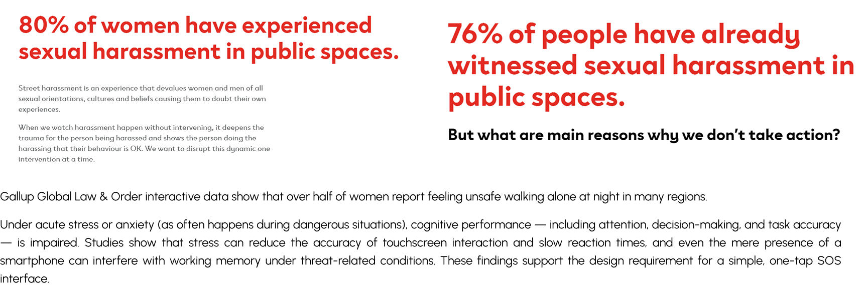
Secondary research confirms over half of women globally feel unsafe walking alone at night (Gallup). Survey confirmed: nearly half faced being followed, harassed, or threatened firsthand.
When danger strikes, people freeze
panicked, didn't know what to do
bystanders didn't react
Acute stress degrades decision-making, touchscreen accuracy, and reaction time — any multi-step interface becomes unusable exactly when it matters most.
People want to prepare, but have no accessible way
want to learn survival skills
have never learned any
75% rated Alerna as highly important (avg 4.6/5) — validating demand before a single screen was designed.
Primary survey: n=10, Google Forms, convenience sampling. Findings are directional.
The real barrier is cognitive, not technical
The 25% who panicked and froze is the most important data point. The problem isn't that people lack an SOS app — it's that stress makes any multi-step interface unusable. This directly justified the one-tap SOS design: a single pre-configured action that works even when the user can't think clearly.
There's a knowledge gap, not just a tools gap
88% wanted to learn survival skills but 63% had never done so. This validated safety guides as a core feature — not an optional add-on. Alerna isn't just a panic button. It's a preparation tool.
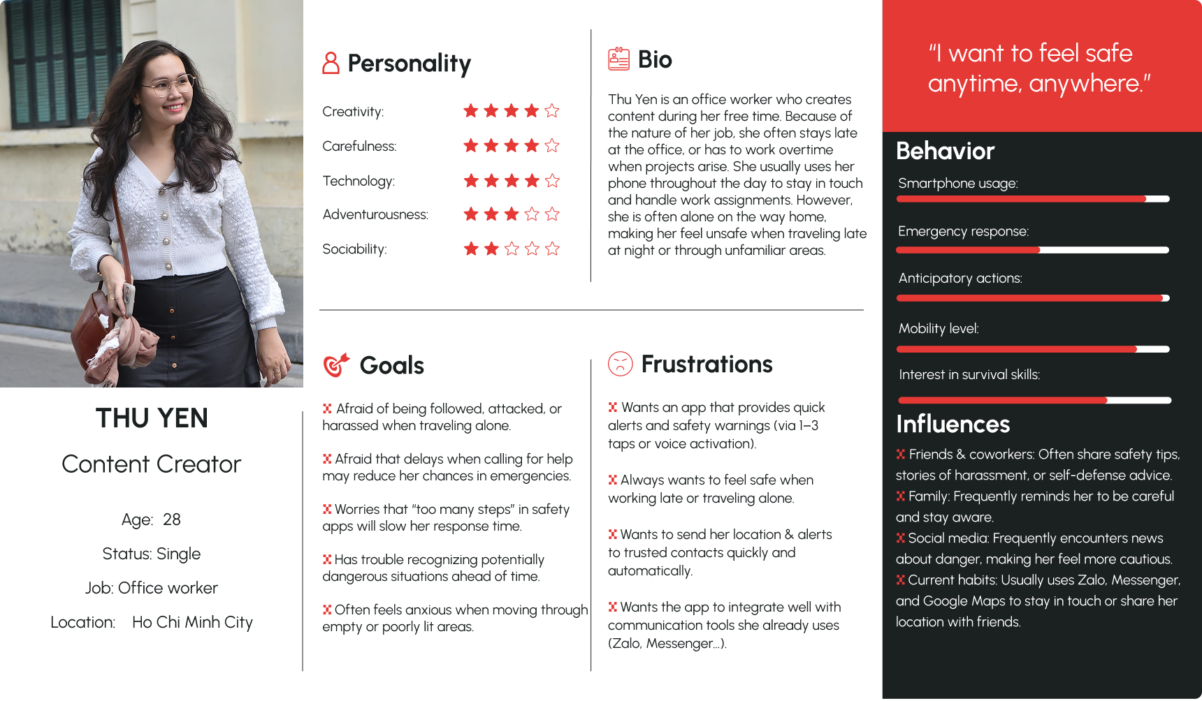
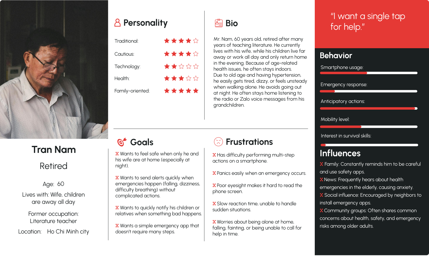
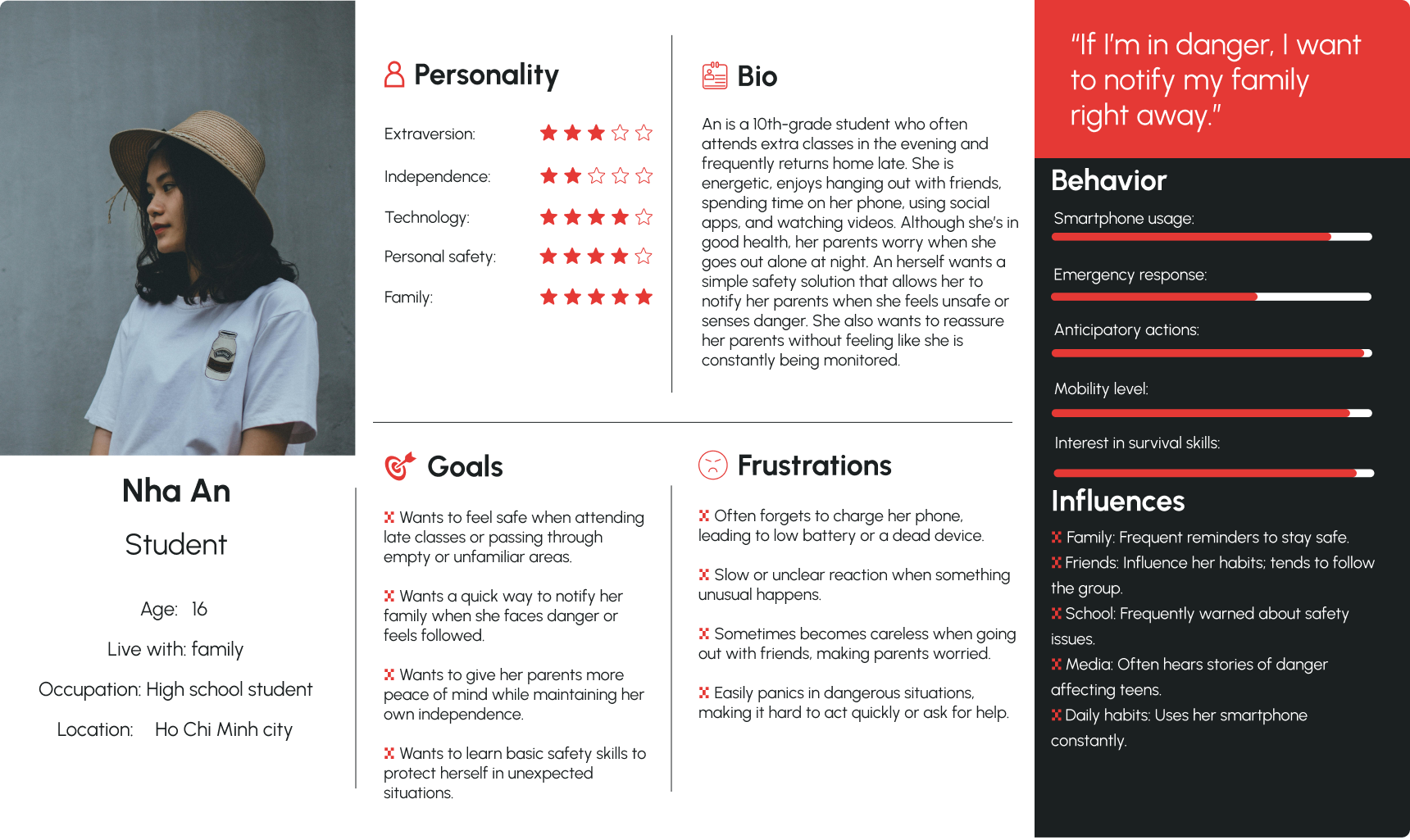
To understand each user's mental model — what they say, think, do, and feel in safety-related situations — I mapped three distinct empathy profiles.
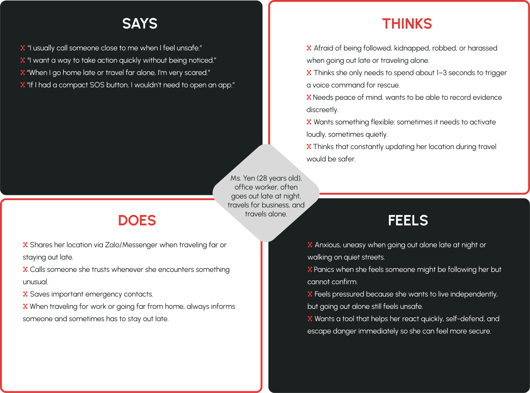
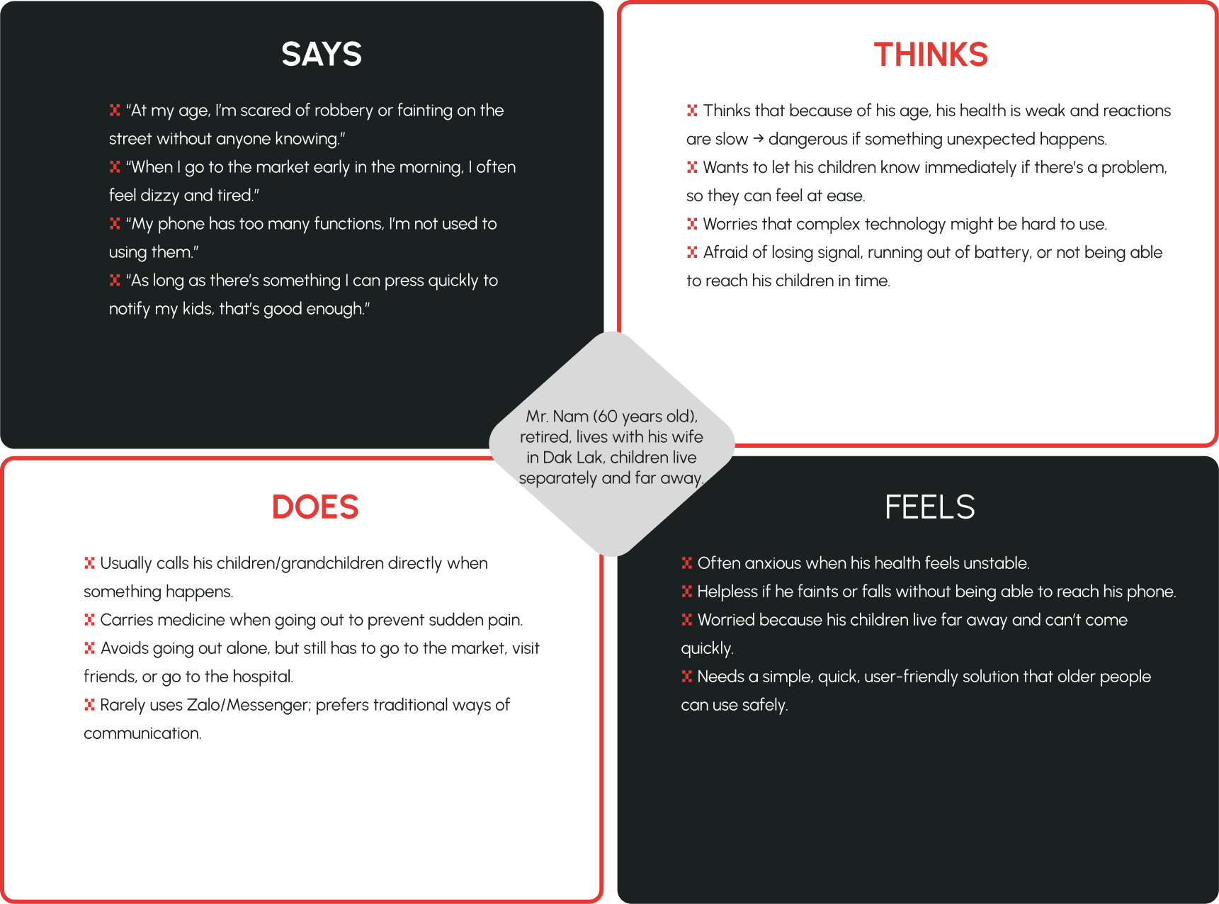
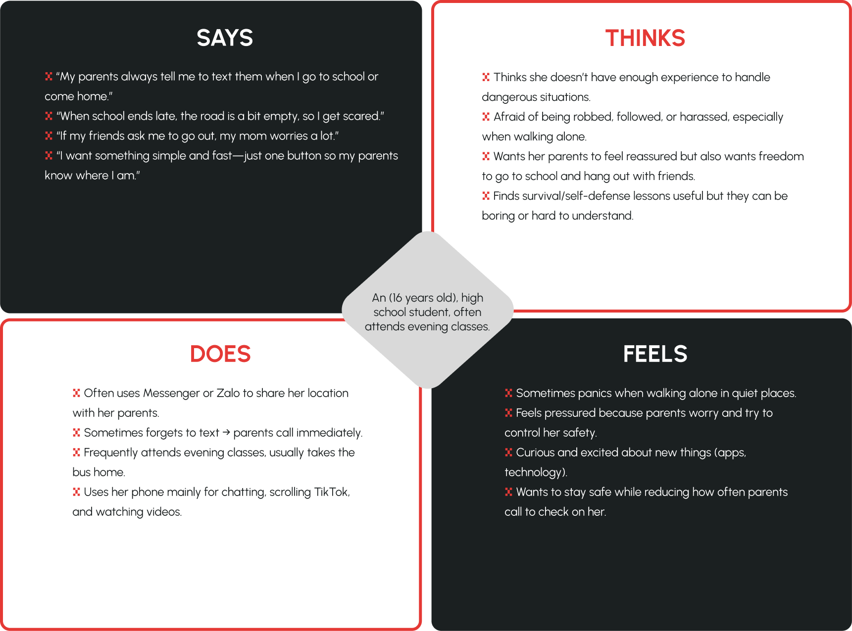
Key tension across all three users: Fear isn't the primary emotion — it's the anxiety of being unreachable and unprotected without knowing it. Each persona doesn't just need a rescue tool. They need the constant background reassurance that help is one tap away.
These empathy maps informed three distinct personas, each representing a different safety context and relationship with technology.
Each persona's core need, expressed as a user story:
As an office worker who commutes alone and works late, I want a one-tap emergency trigger that instantly alerts my family so that I don't have to think or navigate under stress.
As someone managing an unstable health condition, I want to activate SOS without looking at my screen so that I can call for help even when I'm disoriented or panicking.
As a student who travels alone at night, I want the app to automatically share my real-time location with my parents so that they can find me quickly if I stop responding.
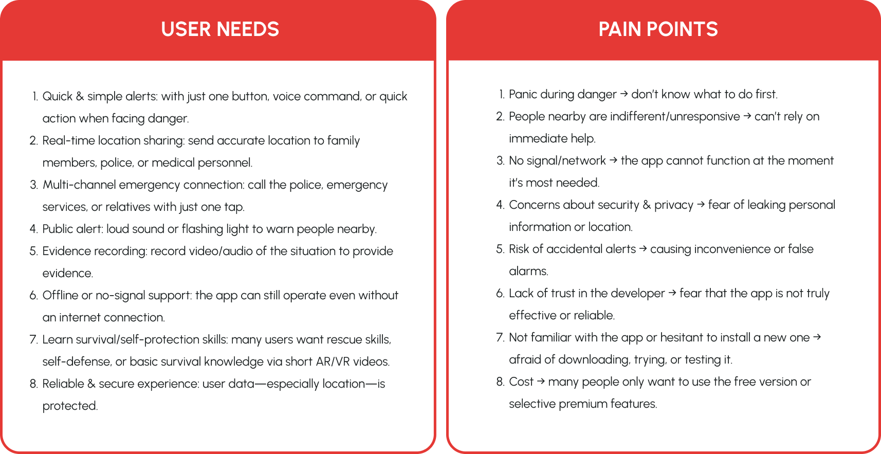
Synthesized from empathy maps and survey responses, these needs and pain points directly shaped every feature decision in Alerna.
To identify the exact moment where existing solutions fail, I mapped Ms. Yen's journey through a real danger scenario — from first sensing threat to reaching safety.
Journey map insight: Across all three scenarios, the critical failure point is the same — the moment between realizing danger and taking action. The journey map confirmed that this window must be reduced to under 2 seconds. Every design decision downstream traces back to this constraint.
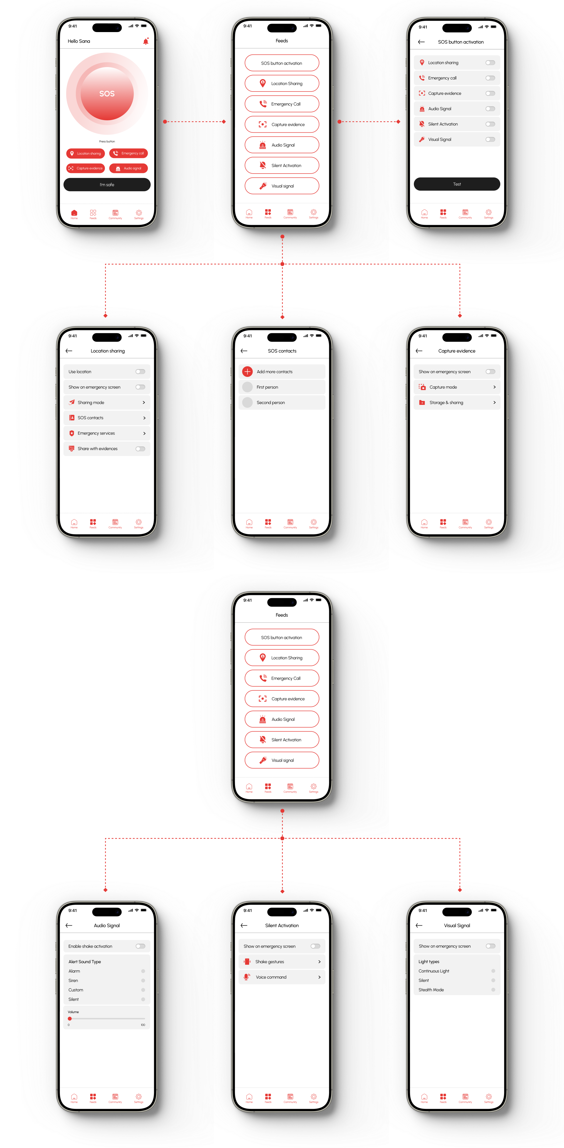
With three distinct user types and a stress-first design constraint, the information architecture needed to solve two competing demands: instant access to SOS from anywhere in the app, and a rich enough feature set for everyday use.
The solution was a flat IA with SOS always persistent — never more than one tap away regardless of which screen the user is on.
The visual language was built around two principles: trust and instant recognition.
Emergency interfaces must be readable under stress — high contrast, clear hierarchy, and zero ambiguity in interactive elements. The color system uses a deliberate red-to-neutral scale where red signals only genuine emergency states, never decorative accent.
The combination of the alarm bell (alert) and the rocket (launch, rapid response) symbolizes an emergency warning being triggered and an immediate response.
Urbanist was chosen for its clean geometry and strong legibility across all screen sizes. The color system combines orange-red and deep yellow to convey urgency, awareness, and protection. Orange-red captures immediate attention and signals emergency action, while deep yellow adds a sense of guidance and reassurance. Together, they create a balance between alertness and emotional safety, reflecting Alerna's mission to protect and support users in critical moments.
Most safety apps add a confirmation step to prevent accidental triggers. But in a real emergency, that extra step is the problem. Users who freeze under stress cannot reliably complete a multi-step interaction. Alerna removes the confirmation entirely — one tap activates the full SOS sequence. Accidental triggers are handled through the cancel flow, not by slowing down the activation.
If someone is being directly threatened, they cannot visibly open an app and press a button. Hidden triggers — shake, pattern tap, voice command — exist precisely for this scenario. Making them a buried setting means most users never find or enable them until it's too late. Building them into the core experience ensures every user has access without any extra setup.
Emergency tools only help if users know how to act when danger arrives. Research showed 88% of people want to learn survival skills, but no existing safety app teaches them. Separating education and response into different products creates a gap — users learn elsewhere, then switch apps in a crisis. Alerna keeps both in one place so the same app that teaches you also protects you.
Onboarding introduces trusted contacts and location permissions upfront — two features that must be configured before an emergency, not during one.
The SOS button occupies the primary visual zone of the home screen — sized for thumb reach (Fitts's Law) and colored red only in active emergency state to prevent accidental triggers.
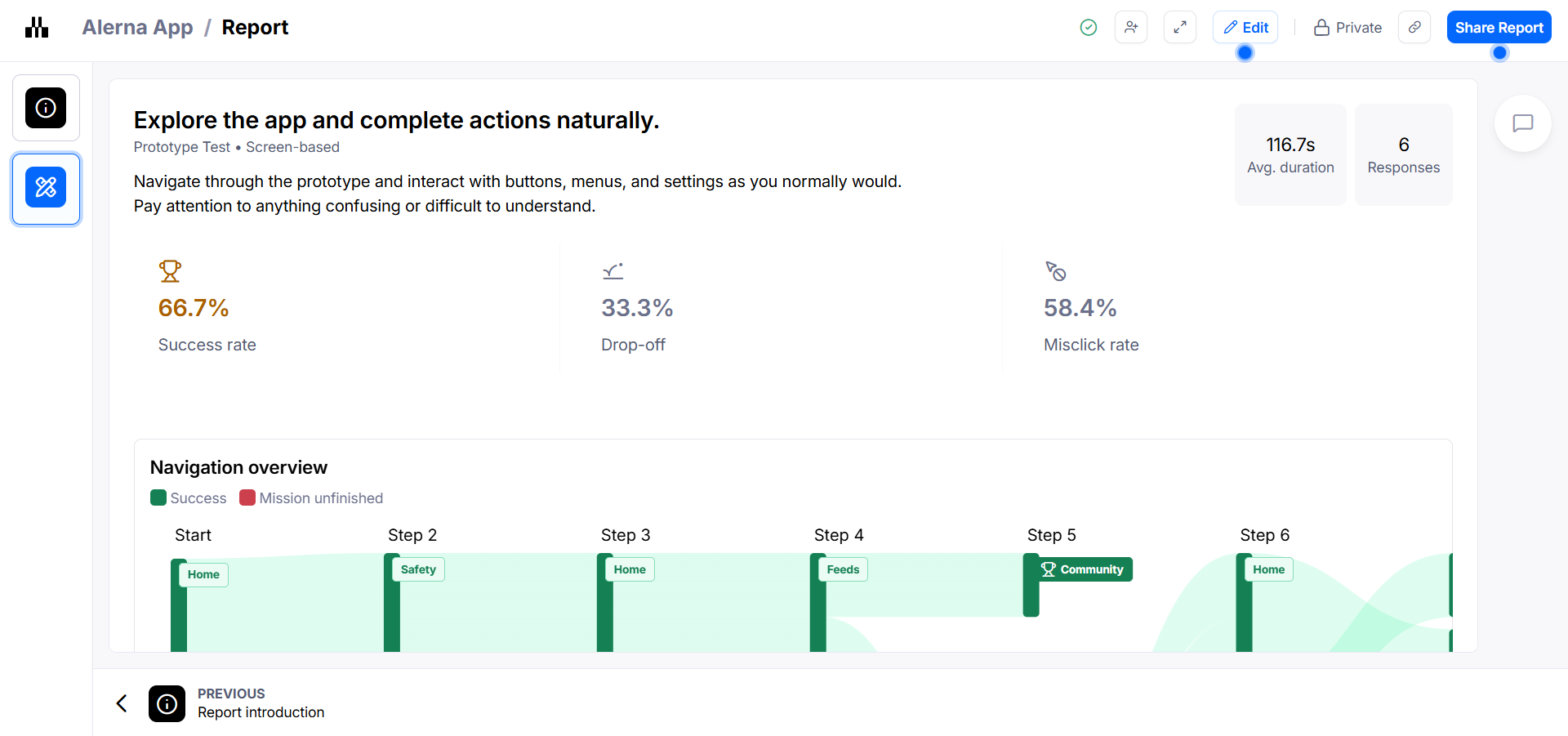
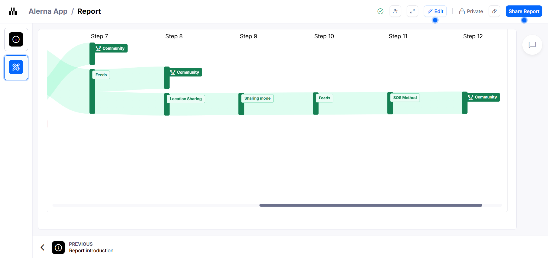
I conducted an unmoderated usability test via Maze with 6 participants, using a screen-based prototype test. Participants were asked to explore the app and complete actions naturally — navigating through prototype screens, interacting with buttons, menus, and settings as they normally would.
4 of 6 participants completed the prototype test
2 participants did not finish — 1 dropped off at 5.93s
High — users struggled to predict where actions were located
Wide variance: 5.93s to 160.95s across participants
| Participant | Outcome | Duration | Note |
|---|---|---|---|
| P1 | Mission unfinished | 38.03s | Dropped mid-navigation |
| P2 | Success | 88.36s | Completed with some exploration |
| P3 | Mission unfinished | 5.93s | Dropped almost immediately — likely disoriented |
| P4 | Success | 160.95s | Completed but took longest — extensive exploration |
| P5 | Success | 150.5s | Completed but navigated non-linearly |
| P6 | Success | 67s | Completed efficiently |
The 58.4% misclick rate indicates users understood the app's purpose but struggled to predict where actions were located. This is a navigation labeling problem, not a concept problem.
The gap between 67s and 160.95s for successful completions suggests users had very different experiences finding the same features. Inconsistent icon recognition or label clarity across navigation tabs is the likely cause.
The two users who dropped off represent a critical failure scenario for a safety app. If a user cannot orient quickly under normal testing conditions, they certainly cannot do so under acute stress — which is exactly the scenario Alerna is designed for. This finding validates the core design principle: the path to SOS must be impossible to miss.
On testing with real users:
Six participants tested the prototype via Maze. The sessions revealed where users hesitated, which flows felt unclear, and which interactions needed more visual guidance. But six people is not enough to confirm patterns — especially across different age groups and stress levels. The next round will focus on recruiting a wider range of participants to surface edge cases the first round missed.
On iteration:
The design is still actively evolving. Layout, button placement, user flow, and language switching have all gone through multiple rounds of revision based on what the prototype tests revealed. Each change is small, but the direction is clearer after every session.
On understanding:
One question that keeps coming up during testing: do users actually understand what this app is for — and why it matters? That question is now driving the next phase. The goal is not just task completion, but genuine comprehension of the app's purpose before an emergency happens.
Alerna is still in active development. The prototype continues to be tested and refined. The next step is running more sessions with a larger group — observing where they get stuck, whether they understand the core concept, and how quickly they can act under a simulated emergency scenario.