ACB ONE - Improving Perceived Performance in Mobile Banking
Redesigning app launch experience and balance-checking flow to reduce friction in Vietnam's digital banking ecosystem
PROBLEM
Problem 1: 20-30 seconds of silent waiting creates perceived system failure.
Problem 2: Full authentication required for a low-risk information task.
OPPORTUNITY
The entry moment in a financial app sets the tone for trust. Silence during startup is interpreted as instability, not just slowness.
Users have different intents. Checking balance ≠ transferring money. Yet both require the same friction level. Aligning access with risk would reduce daily micro-friction.
SOLUTION
Solution 1: Add mascot animation during loading to provide system feedback.
Solution 2: Create notification preview layer on login screen for low-risk balance checking.
The current app launch reveals two critical UX issues
ROLE
Solo UX/UI Designer — design exploration, interaction design
TIMELINE
2 months
TOOLS
Figma, After Effects
TYPE
Personal design exploration based on real user pain points
RESEARCH APPROACH
Personal Usage Observation (6+ months)
Daily app usage, noting performance patterns
Identifying exact friction moments
Understanding workaround behaviors
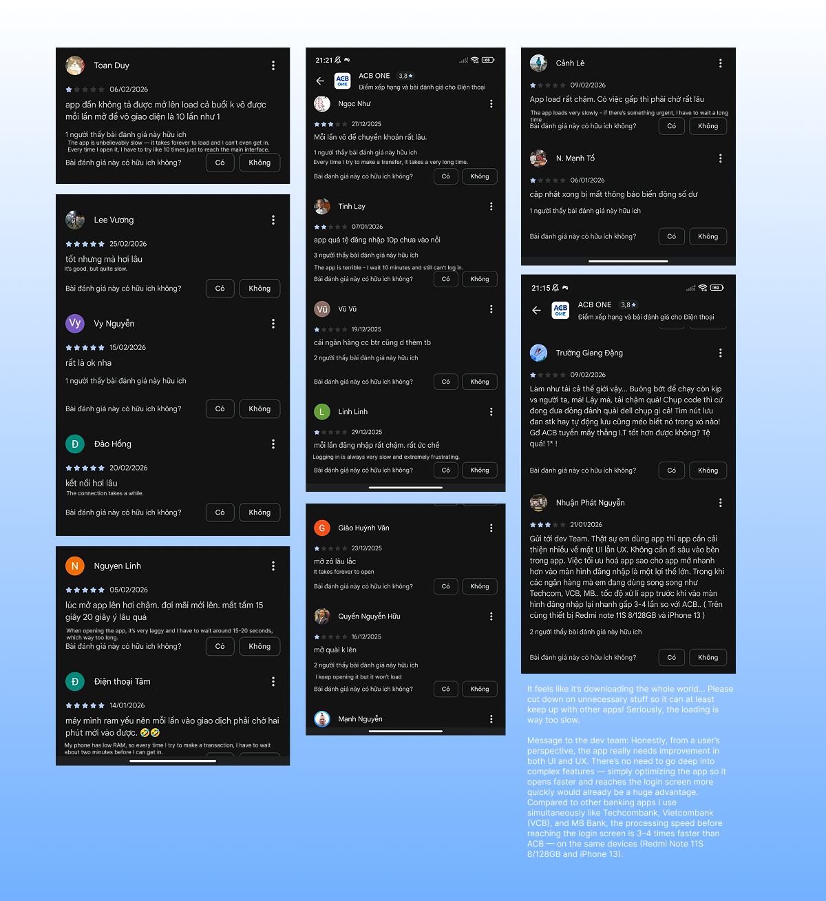
App Store Review Analysis (100+ reviews)
Collected real user feedback from Google Play Store
Identified recurring pain point patterns
Verified personal observation against public data
Family Observation (4 users)
Watched different age groups use the app naturally
Noted frustration points
Important Note:
This is a personal design exploration, not a formal proposal with statistically significant research. Production implementation would require formal user research and stakeholder validation.
THE EVIDENCE
Problem 1: Silent Loading Creates Uncertainty
Real User Feedback (Google Play Store Reviews)
Users describe the loading experience consistently:
"Too slow, I thought the app was frozen""Every time I open it, it lags for 20-30 seconds""App is much slower than Vietcombank or Techcombank"
Why This Pattern Matters
Recurring frustration (not occasional complaint)
The issue appears across multiple reviews from different users at different times. This indicates a systemic problem, not an edge case or one-time glitch.
Users explicitly compare ACB to competitors. They've experienced faster banking apps from other providers. This benchmarking means ACB is perceived as slower relative to available alternatives — not just slow in absolute terms.
Pre-interaction friction (affects first impression)
Frustration occurs before login even begins. Users encounter the problem at the entry moment — before they've even authenticated or started any task. This shapes their perception of the entire app's competence and quality.
Problem 2: Barrier to Information (Not Action)
Real User Behavior Pattern
Users frequently open ACB One to quickly check balance — a low-complexity task that shouldn't require complex processes.
Why This Is a Problem
Violates Hick's Law (reduce steps for simple tasks)
User intent: Check balance (single action)
Current process: Username → Password → OTP (3+ steps)
Gap: Too many steps for too simple a task
Breaks user expectation from competitors
Other banking apps allow quick balance preview
ACB requires full authentication
User frustration: "Why does Vietcombank let me see balance faster?"
Full auth demands: remember password, enter username, wait for OTP, then finally see balance
User brain: "All this for just checking a number?"
DESIGN SOLUTIONS
Solution 1: Loading Animation
Decision 1: Why add a mascot animation during loading, not just accept the wait?
The 20-30 second startup time is unavoidable due to backend constraints. But silence during that wait makes users think the app is frozen.
A mascot animation provides visible feedback — showing that the system is working, not broken. Users can tolerate longer waits as long as they know something is happening.
The mascot was chosen over a generic progress bar because it reinforces brand familiarity (the "One" character already exists in the app) and feels more reassuring in a moment of uncertainty.
Design Concept
The 20-30 second startup time is unavoidable due to backend constraints. But silence during that wait makes users think the app is frozen.
A mascot animation provides visible feedback — showing that the system is working, not broken. Users can tolerate longer waits as long as they know something is happening.
The mascot was chosen over a generic progress bar because it reinforces brand familiarity (the "One" character already exists in the app) and feels more reassuring in a moment of uncertainty.
Solution 2: Balance Preview on Login Screen
Decision 2: Why show a balance preview on the login screen without full authentication?
Users frequently open the app just to check if their balance changed — a simple, read-only task that doesn't require transferring money.
Currently, every interaction demands full authentication (username → password → OTP), which is excessive friction for checking information.
A preview layer lets users see what they need instantly, without waiting for full login. If they want to transact, full authentication is still required.
This matches the security level to the actual risk — protecting high-risk actions while reducing friction for low-risk ones.
Design Concept
The login screen is redesigned to include a notification preview section. This section surfaces high-level information such as recent balance changes or transaction activity without showing detailed financial data.
The preview is intentionally limited to maintain security integrity — it doesn't allow any actions or show sensitive information.
Users can quickly see if something changed and then decide if they need to log in fully for more details. This respects user intent while keeping the system secure.
LIMITATIONS & NEXT STEPS
What This Exploration Cannot Address
Designed without formal user research or usability testing
Based on personal observation and public review data only
Not validated with ACB's actual user base or internal stakeholders
Conceptual scope — does not include full app redesign or implementation details
Notification preview security model not audited by banking compliance team
No quantitative data on actual impact (speed improvements, friction reduction)
For Production Implementation, Would Require
User Research (Formal)
☐
Quantitative usability testing (50+ users) via Maze or UserTesting
☐
Formal user interviews (15-20 users) about balance-check frequency and loading frustration
☐
A/B test: Current flow vs proposed solution (measure: task completion time, success rate, perceived friction score)
☐
NPS/satisfaction survey: before & after solution perception
Business & Stakeholder Alignment
☐
Internal alignment with PM, security team, backend engineering
☐
Risk assessment: security implications of notification preview (PII exposure analysis)
☐
Impact projection: how solutions affect user engagement, retention, NPS
☐
Roadmap prioritization: does this fit current business priorities?
Technical Validation
☐
Performance testing — animation FPS on low-end Android devices
☐
Network behavior testing — behavior during slow 3G connections
☐
Confirm animation doesn't delay login further
☐
Backend capacity analysis for notification preview data retrieval
Security & Compliance
☐
PII audit — confirm preview doesn't expose sensitive data
Encryption verification for locally-stored preview data
☐
Session timeout behavior validation
Accessibility
☐
Screen reader support for notification preview
☐
WCAG 2.1 AA color contrast validation
Design System & Handoff
☐
Align with ACB design tokens and component library
☐
Create detailed component specifications for developers
☐
Document animation timing, easing curves, and all interaction states
REFLECTION
What This Project Demonstrates
Problem identification from real user behavior — not hypothetical scenarios
Design thinking applied within constraints — working with what you can control
Understanding of security-convenience tradeoffs
Honest scoping — distinction between exploratory work and production-ready work
Strategic problem reframing — shifting how to approach the problem
What I Learned
By treating a real user problem as a design exercise, I understood:
The gap between identifying problems and proposing solutions
How to work within constraints (can't change backend, can improve UX)
The importance of honesty about scope and limitations
Why understanding user context matters more than flashy designs
Key Insight
The best solution isn't always the most technically complex. Sometimes it's reframing the problem: instead of "how do we make it faster?" ask "how do we communicate it's working?"
Both questions are valid. Good design recognizes which one you can realistically answer with available constraints.