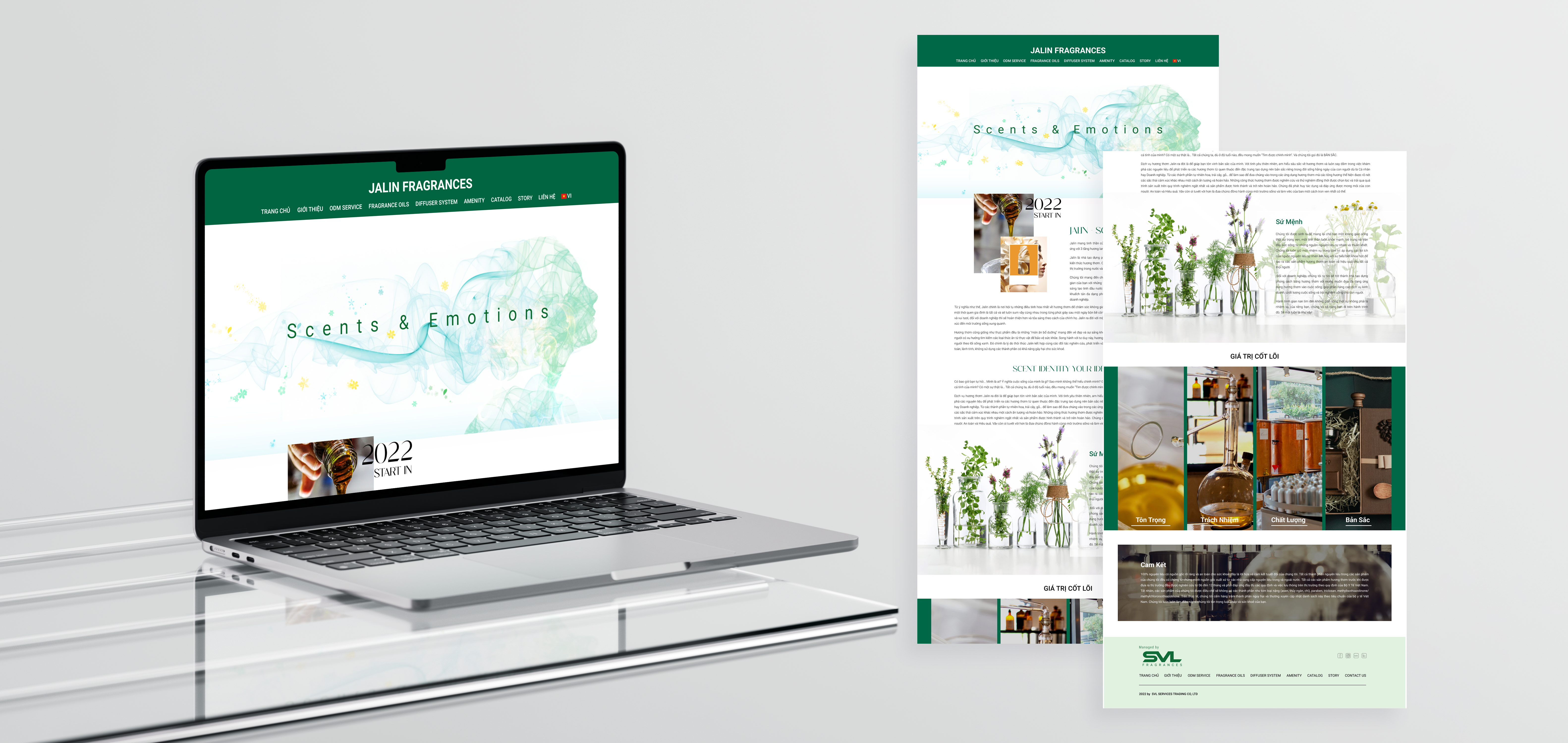
Case Study · 2024
Repositioned Vietnam's B2B fragrance leader for international market entry through strategic IA restructuring, premium visual system, and enterprise trust architecture.
The previous site told the wrong story. A soft mint palette and botanical patterns read as consumer lifestyle — not the precision-driven, enterprise-grade partner B2B clients needed to see.
Jalin was actively pitching to major domestic corporations and targeting international fragrance partners. The website needed to match that ambition — and open doors before a single conversation happened.
A complete brand repositioning through design: premium typography, restructured IA around five core service lines, and a visual language benchmarked against Givaudan, Firmenich, and Scent & Scent.
Lead Designer (End-to-End), Web design strategy, IA restructuring, visual system design, stakeholder management, dev handoff specifications
5 months (January 2024 - May 2024)
Figma, FigJam
Real client - B2B Fragrance Redesign for International Market Entry
Research Approach
Due to project scope and timeline, research was conducted through three primary methods rather than formal usability testing.
| Method | What We Did |
|---|---|
| Stakeholder Discovery | Cross-functional kickoff with sales, R&D, and marketing teams to surface business goals, client pain points, and competitive gaps. |
| Competitive Analysis | Benchmarked against Givaudan, Firmenich, and Scent&Scent — global fragrance leaders — to establish visual and structural standards. |
| Behavioral Insight | Sales team feedback revealed B2B users follow a discover → validate → contact pattern, rarely converting on-site. Primary contact channels: Zalo, Messenger, phone. |
B2B buyers don't convert on the website — they use it to validate credibility before reaching out directly. This insight shifted our design priority from transactional UI to brand impression and service clarity
Procurement leads at banks, hotels, shopping malls, and corporate offices — evaluating Jalin as a long-term scenting partner. Their goal: validate credibility and capability before initiating contact.
Primary Goal Assess if Jalin is the right enterprise partner — fast.
Businesses seeking custom fragrance development or diffusion system solutions. They arrive with a specific service in mind and explore to confirm Jalin can deliver — then reach out directly.
Primary Goal Find the right service and confirm technical capability.
Problem Definition
"The brief wasn't 'make it look better.' It was: redesign Jalin's digital presence to communicate enterprise credibility to B2B clients who judge capability before initiating contact."
Design Principles
Before IA or visual decisions, four principles were established to guide every design choice throughout the project.
Every element must signal enterprise-grade trust, not lifestyle appeal.
B2B users are task-oriented — service clarity beats visual complexity.
Users don't convert on-site. Design for brand validation, not CTA clicks.
Restraint is the luxury signal — whitespace and typography, not ornamentation.
Information Architecture
IA is a structural decision made before design begins — not a visual one. Restructuring navigation was the first step to solving the discovery problem.
IA restructured around Jalin's 5 core service lines — ODM Development, Diffusion Systems, Fragrance Oils, Amenity, Catalog — ensuring B2B visitors can orient and validate capability within seconds of landing.
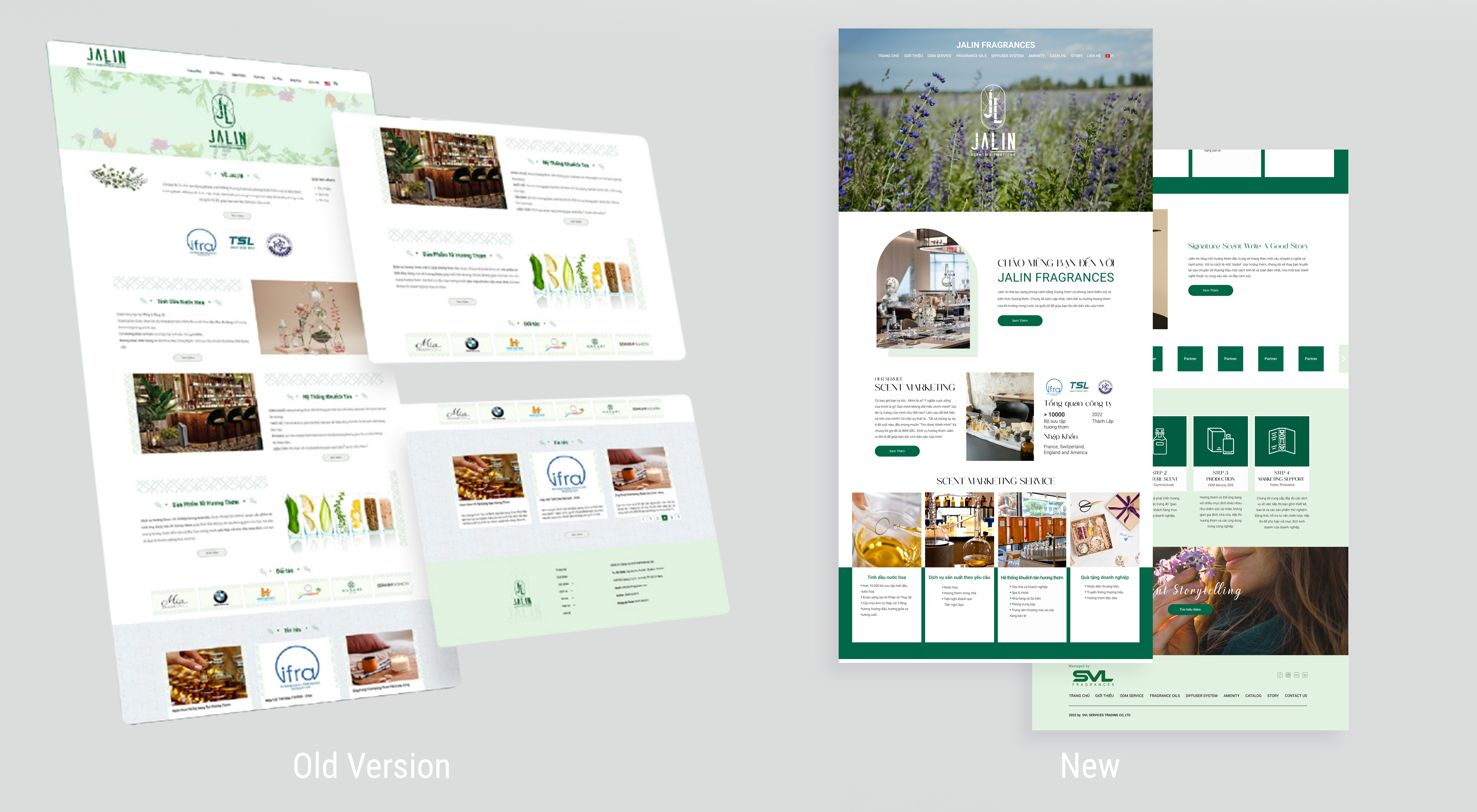
7 generic nav items — services buried, no B2B orientation
✕ Services and products merged into 2 vague categories — B2B visitors can't identify Jalin's actual capabilities at a glance
5 service-first nav items — B2B visitors orient within seconds
✓ Each service line surfaced directly — enterprise buyers immediately identify relevant capabilities without navigating sub-menus
"From Consumer Lifestyle to Enterprise Partner — What Changed and Why"
A cohesive visual language was established across typography, color, and UI components — ensuring every element communicates the same premium, enterprise-grade identity.
Typography
Rantera was selected after multiple rounds of exploration as the primary typeface. As a licensed font localized for the Vietnamese market, it signals international premium positioning — a deliberate investment to differentiate Jalin from local competitors using generic web typography.
Color System
The palette draws from the olfactory world — deep earth tones, warm neutrals, and restrained accents that evoke premium fragrance without literal representation.
Components
Key UI components — buttons, cards, navigation states, and form elements — were designed to maintain visual consistency and reinforce brand trust across every page.
[ Export design system sheet from Figma → save as Img/Jalin/Design-System.png ]
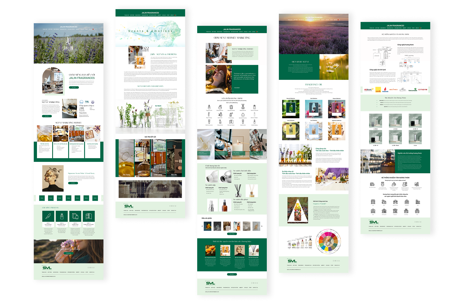
Once the overall direction was approved, I began designing the website layout and visual system. Early layouts and prototypes were presented to stakeholders to communicate structure, page flow, and the overall browsing experience.
To maintain visual consistency, I also designed and curated all website imagery, ensuring that visuals aligned seamlessly with the brand's scent philosophy and luxury positioning.
Competitive analysis of global fragrance leaders - Givaudan, Firmenich, and Scent&Scent - established the visual benchmark. These sites shared a consistent language: editorial restraint, clear service hierarchy, and premium typography. The gap between those references and Jalin's existing site made the direction clear.
A significant early decision was typography. After multiple rounds of exploration, I proposed purchasing and localizing the Rantera typeface specifically for the Vietnamese market - a custom font investment that would set Jalin apart from local competitors and signal premium positioning in a way no generic typeface could.
The information architecture was restructured around Jalin's five core service lines: ODM Development, Diffusion Systems, Fragrance Oils, Amenity, and Catalog - each surfaced as primary navigation, ensuring B2B visitors could orient themselves within seconds of landing.
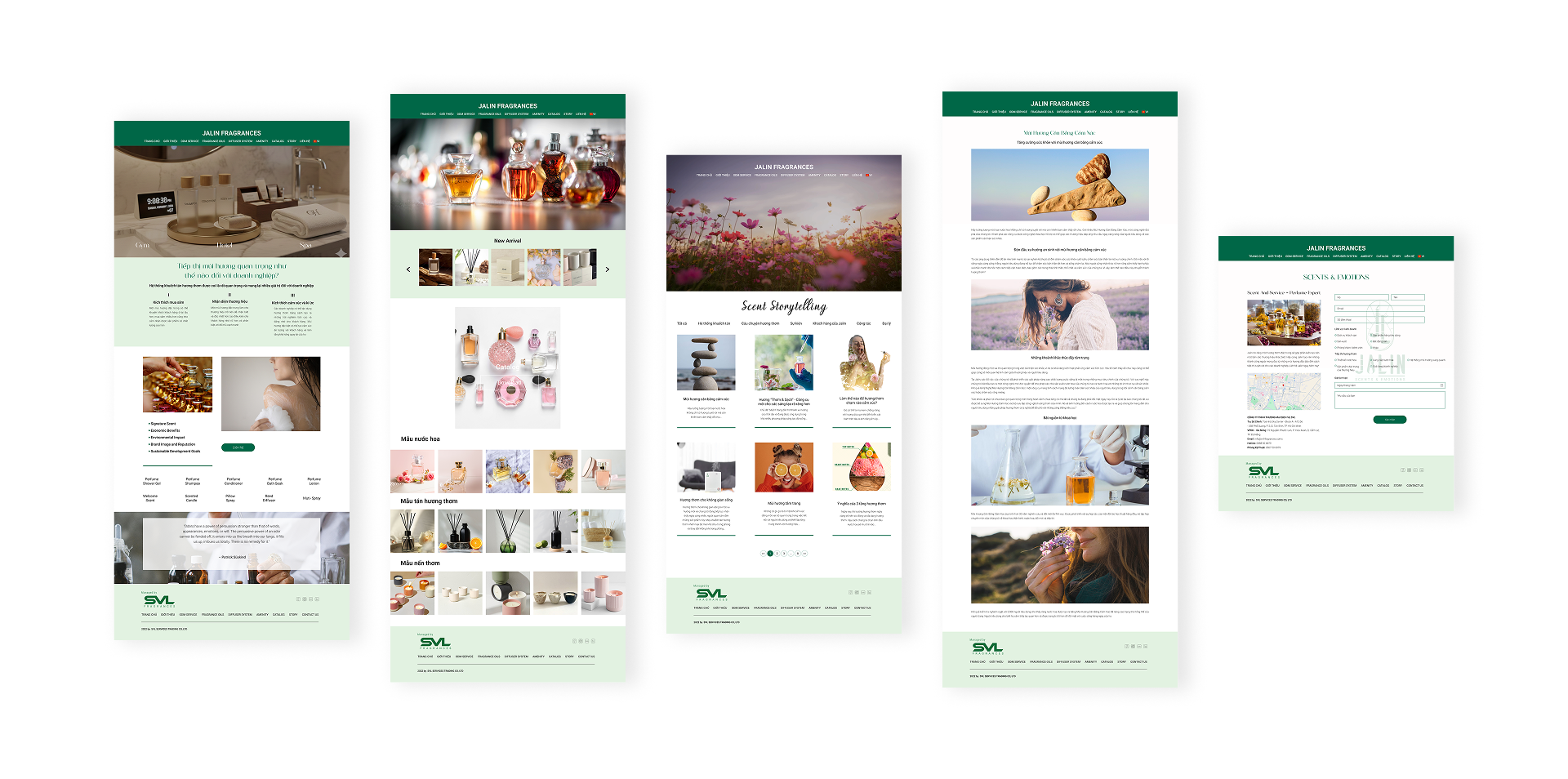
The design went through multiple structured feedback cycles between the design team, company leadership, and the external development team. Each round was documented and resolved systematically.
Feedback focused on layout spacing, content alignment with brand voice, and section restructuring. Key changes requested included:
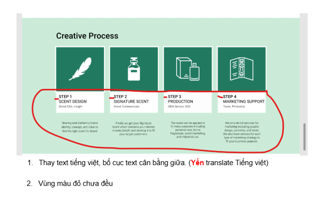
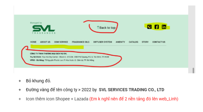
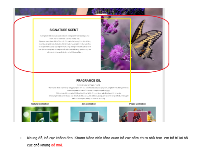
After handoff, feedback shifted to implementation accuracy — ensuring the final website matched the Figma specifications. Issues addressed included:
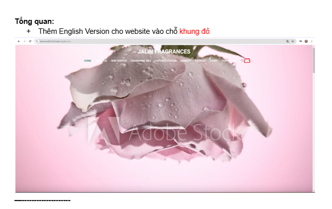
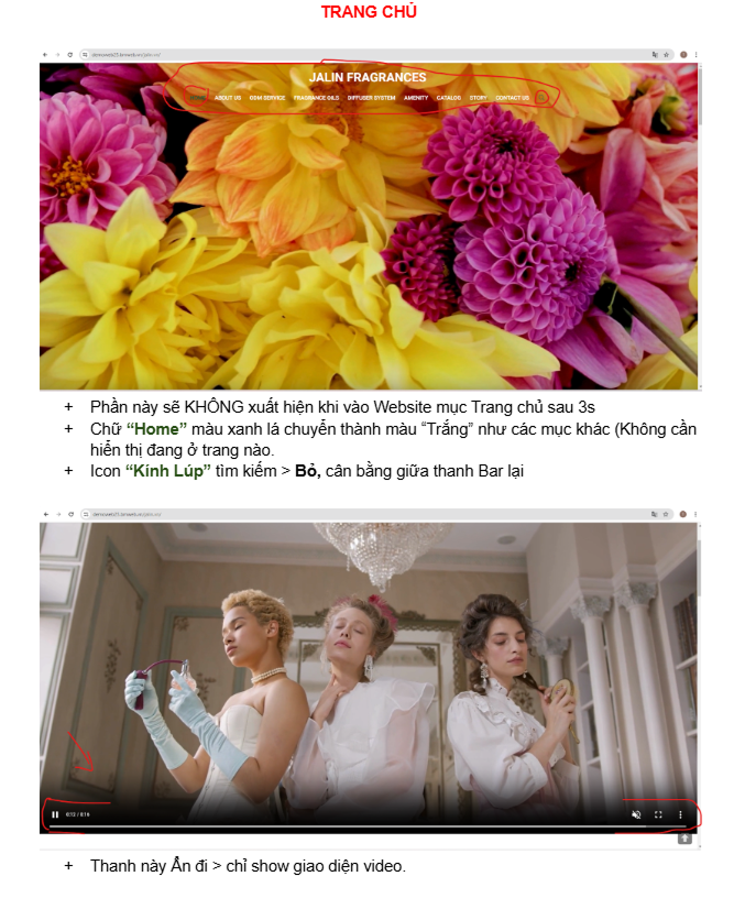
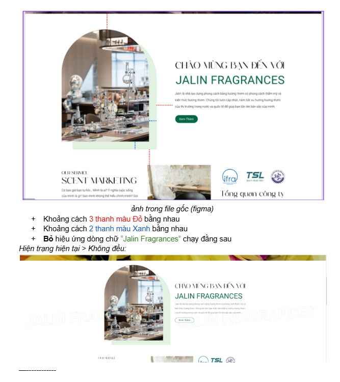
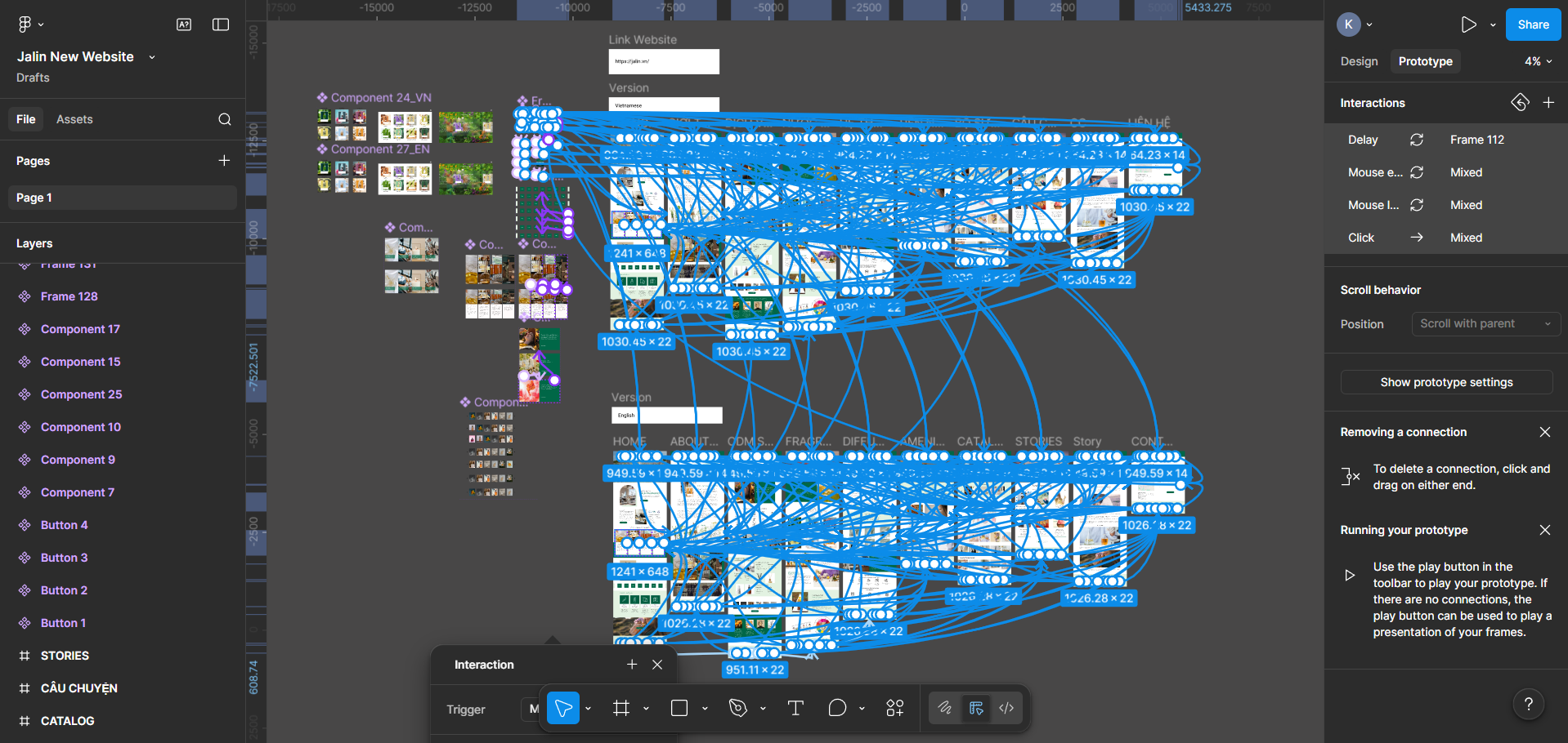
During the handoff phase, I collaborated directly with an external development team. Layout files were delivered with clear instructions on animations, page transitions, and interaction behaviors to ensure the final website reflected the intended experience.
Subtle animations and transitions were used to enhance the sense of elegance without overwhelming the content, supporting a smooth and refined browsing experience.
Working with an external dev team for the first time, I learned that a design file alone is not a complete spec. When the initial demo came back misaligned, I worked with the marketing team to re-brief the dev team with more structured annotations - detailing interaction states, timing curves, and edge cases. The experience fundamentally changed how I approach handoff documentation.
Performance Audit
Post-launch performance was validated via Google PageSpeed Insights (Chrome UX Report, desktop + mobile). Core Web Vitals assessment: Passed — measured across real user sessions over a 28-day collection period.
Desktop
Mobile
Audit source: Google PageSpeed Insights — Chrome UX Report (May 3–30, 2026). Scores reflect real user sessions across desktop and mobile devices. Website has evolved since the May 2024 launch; these metrics represent the current live state of the design system.
Qualitative Impact
Quantitative conversion data was managed by the marketing team and outside designer access scope. Qualitatively, the sales team reported increased confidence presenting the website in enterprise pitch meetings — a direct reflection of the project's primary objective.
"International standard with a Vietnamese soul."
— Leadership, at launch review
ODM and diffusion system inquiries increased post-launch, consistent with the discover → validate → contact behavioral pattern identified during the research phase.
I'd establish a measurement framework before launch — defining success in trackable terms, not just stakeholder approval. I'd also front-load the process with at least lightweight usability validation, even when formal testing isn't feasible within scope.
Working with an external dev team for the first time showed me that a Figma file is not a complete specification. I left with a fundamentally different understanding of what handoff-ready means — and it has shaped how I document every project since.
Design decisions need to be defended with reasoning, not just shown. Learning to communicate why — to stakeholders who think in feelings, not frameworks — is a skill as important as the design itself. Iterating through nearly a month of revision taught me that showing multiple versions isn't a sign of uncertainty; it's a tool for building shared understanding.